The project
In my role as first Senior Creative Copywriter, then Creative Lead at Scope, I played several key roles in the refreshing of a national charity's brand.
Feeding back on agency concepts
Shaping initial work to be reflective of the charity and its mission
Taking basic tenets and turning them into a complete tone of voice
Leading the internal team on a day to day basis to build the brand guidelines
Working with stakeholders throughout the organisation to assess needs, then build out written and visual content to rebrand every major touchpoint
Follow the journey below.
Where we were
Scope had been on a journey, from a charity which focussed on care and service provision, to a campaigning movement for social change.
In 2022 work began on creating a brand which reflected not just this shift, but the ambition to truly represent the lives of all disabled people.
This ambition could only be achieved through two central points:
1. To place disabled peoples’ lived experience at the heart of the brand.
2. To communicate as clearly and vibrantly as possible with everyone we can, we must create our most accessible brand yet.
The journey
Together with our agency partner Dragon Rouge we gathered lived experience groups drawn from staff, Scope members and the general public. These diverse groups, nearly 1000 disabled people and carers from around the UK, helped to guide the brand’s development, to challenge assumptions and check every detail to make sure that accessibility was a key consideration.
Scope’s in-house accessibility team provided the technical knowledge to test every aspect of the concepts created. Each individual asset designed was gauged on its ability to communicate without barriers. For example, all information-carrying design has a contrast rating of AAA, the highest possible, and more than 3000 colour combinations were tested to make Scope’s website as clear as possible to all.
The results
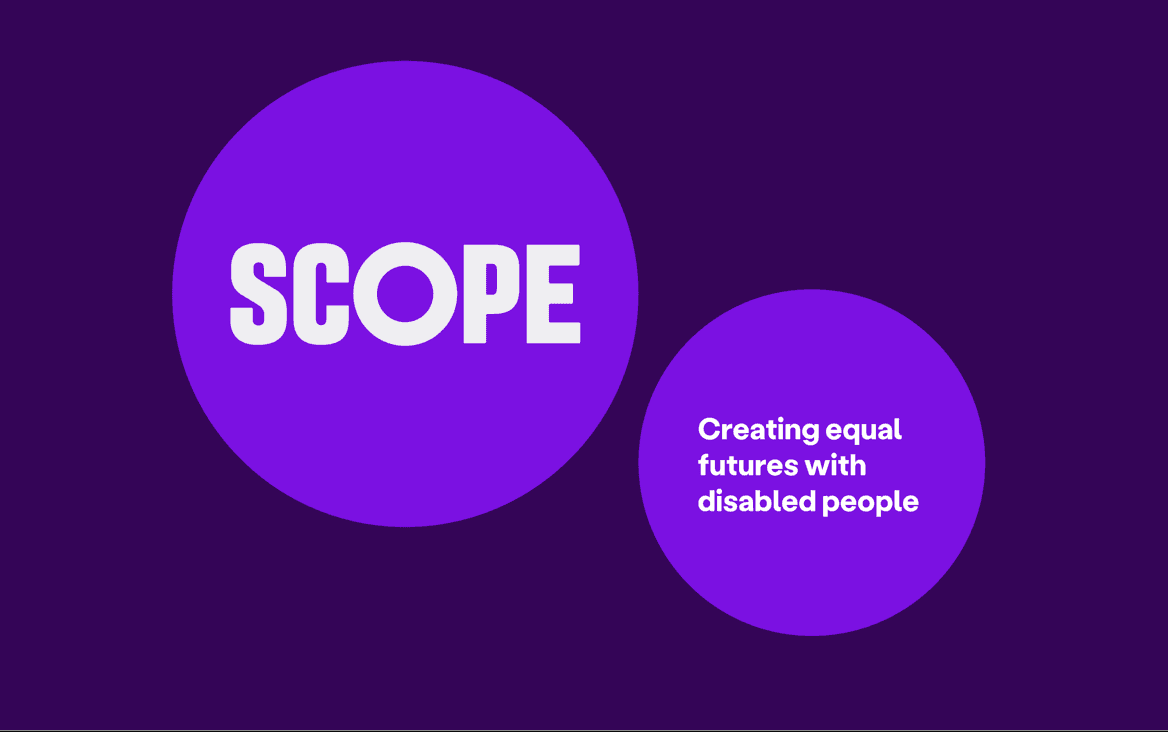
Scope's new logo centres our role as an amplifier of disabled voices, with the circular ‘O’ speaking to the all-round impact they want to create, creating space for disabled people and showing that everyone is in Scope.
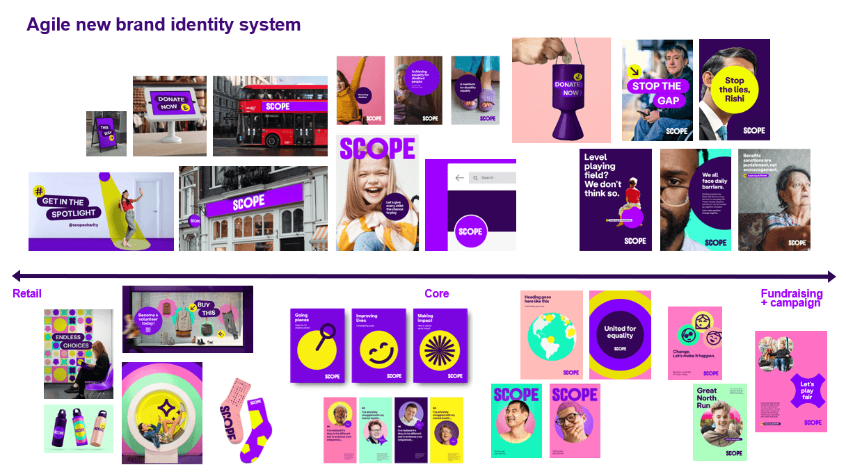
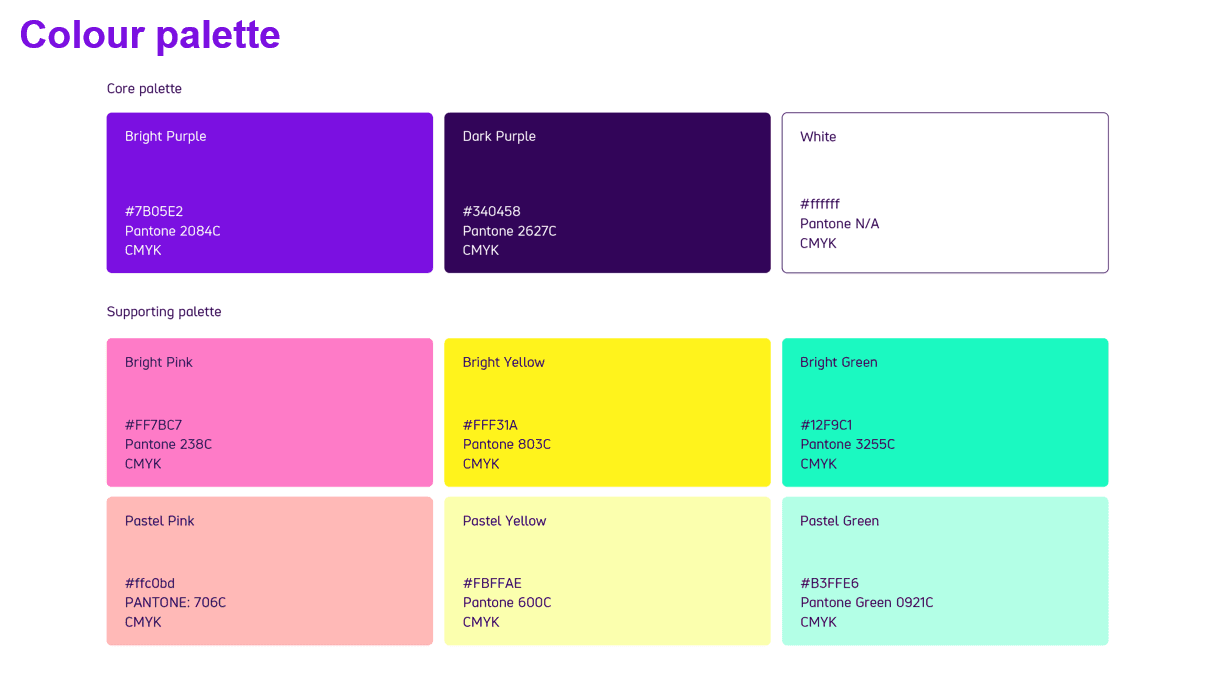
The colour palette has broadened to allow much greater freedom of expression, addressing the different needs of campaigning, fundraising, and retail. Now Scope can set the right tone for the right audience.
Design assets are vibrant but 100% functional. Each one is linked to the identity as an amplifier of disabled voices, and each is a tool for a job rather than decoration.
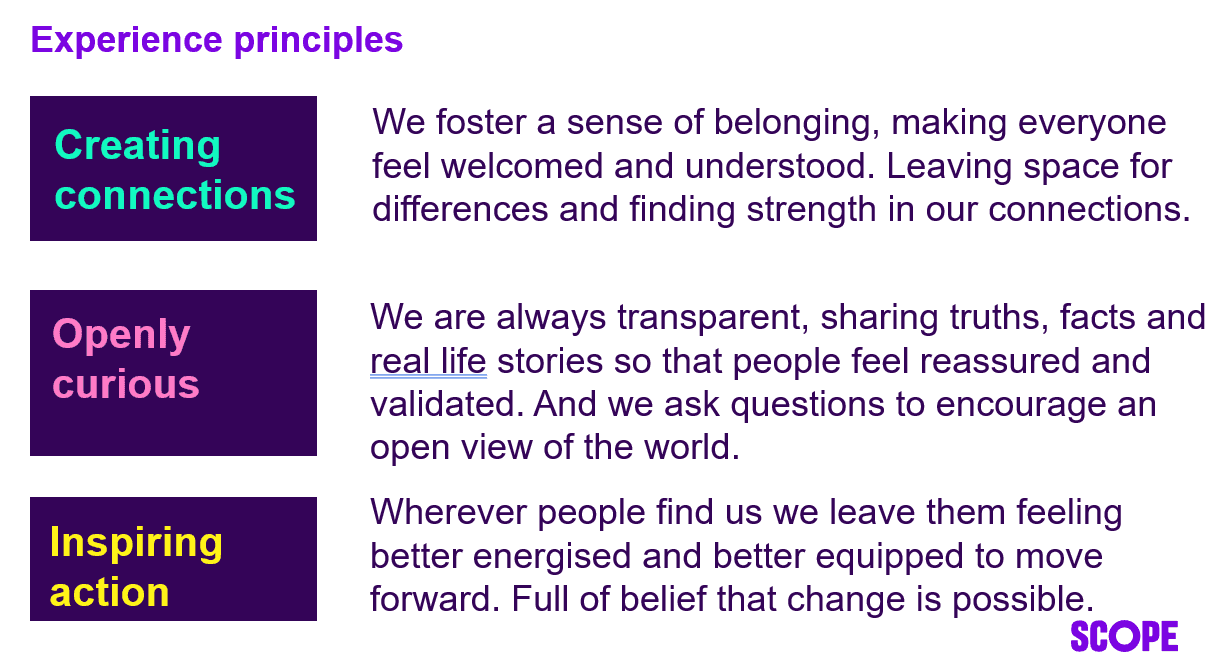
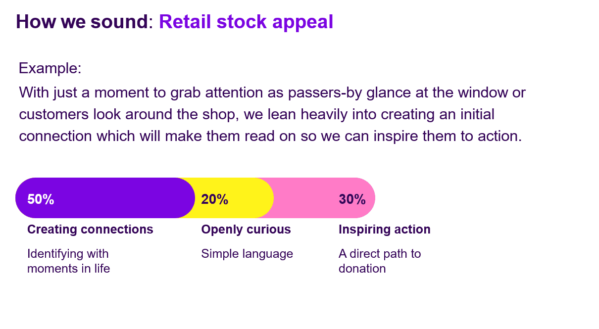
The tone of voice prioritises clarity, while allowing far greater flexibility to address the challenges many disabled people face, as well as the opportunities we can create together.